InNepall

You can contact us at:

Buddhanagar
Kathmandu, Nepal
9818500185
Sun-Thurs 10:00am-6:00pm
mail@innepall.com
24 X 7 online support
ShareThis:
Comments
Top Responsive Website Testing Tools
Top Responsive Website Testing Tools © Code Space Services

Top Responsive Website Testing Tools

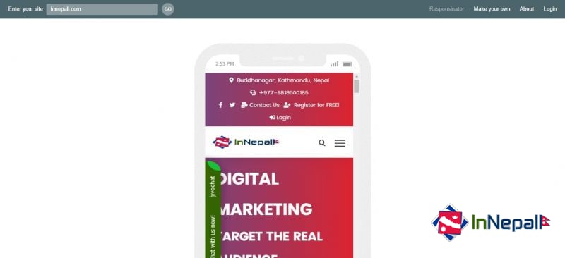
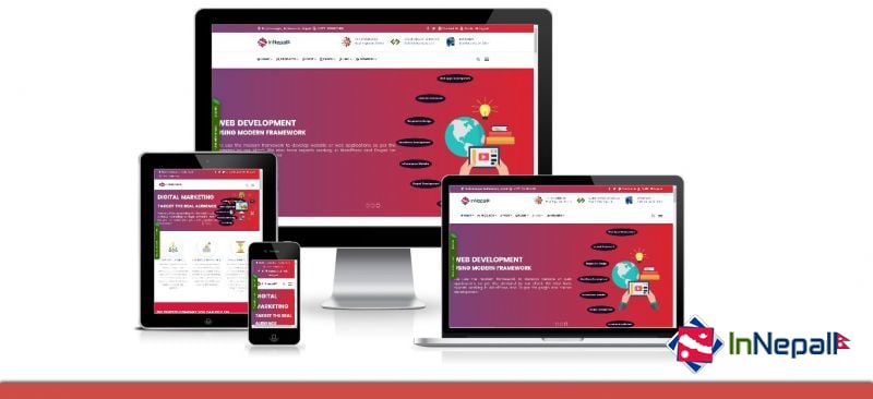
Responsive Web Design (RWD) is an approach to web design that helps websites render well on multiple devices and window or screen sizes. The recent work also considers the viewer's proximity as part of the context of view as an extension to the RWD. Content, design and performance are necessary on all devices to ensure availability and satisfaction. Responsive web design has become more important as the amount of mobile traffic now accounts for more than half of the total Internet traffic.

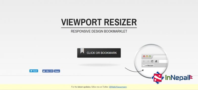
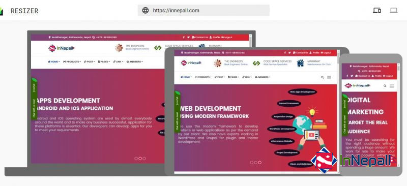
Here we have listed the free tools that will help you test your responsive websites and make adaptive to all sized device. If you know more than you can let us know so that we can add more in this list.

Responsinator

Responsinator

Responsinator

Responsinator Responsive Design Testing Tool

The Responsinator is designed to test responsive websites on different device resolutions

Responsinator helps website makers quickly get an indication of how their responsive site will look on the most popular devices. It does not precisely replicate how it will look, for accurate testing always test on the real devices.

Ads

Sponsor
Viewport Resizer

Viewport Resizer

Viewport Resizer

Viewport Resizer Responsive Design Testing Tool

Viewport Resizer is a browser-based tool to test any website’s responsiveness. Just save the bookmarklet, go to the page you want to test, click on your created bookmarklet and check all kinds of screen resolutions of the page.

The smartest way to share your defined environment of devices and breakpoints directly with your team and client.

Media Queries

Media Queries

Media Queries

Media Queries Responsive Design Testing Tool

Media Queries is a W3C Candidate Recommendation—a widely reviewed document which is ready for implementation by browser vendors.

It's an extension of media dependent stylesheets tailored for different media types (i.e. screen and print) found in CSS2.

In its essence a media query consists of a media type and an expression to check for certain conditions of a particular media feature. The most commonly used media feature is width.

By restricting CSS rules to a certain width of the device displaying a web page, one can tailor the page's representation to devices (i.e. smartphones, tablets, netbooks, and desktops) with varying screen resolution.

Ads

Sponsor
Am I Responsive

Am I Responsive

Am I Responsive

Am I Responsive? Responsive Design Testing Tool

Show off how responsive design looks across different browsers easily with this 4 in 1 viewport tool. See how your site looks on desktop, laptop, ipad & iphone.

I take a lot of screen shots of the various device breakpoints for responsive design and it takes a while to prepare them. This tools allows you to get what you need quickly, and hopefully it can be helpful for showing your more visual clients what you mean by responsive design when a suite of products isn't at the ready.

Resizer

Resizer

Resizer

Resizer Responsive Design Testing Tool

An interactive viewer to see and test how digital products respond to material design breakpoints across desktop, mobile and tablet.

Ads

Sponsor
Buddhanagar
Kathmandu, Nepal
9818500185
Sun-Thurs 10:00am-6:00pm
mail@innepall.com
24 X 7 online support